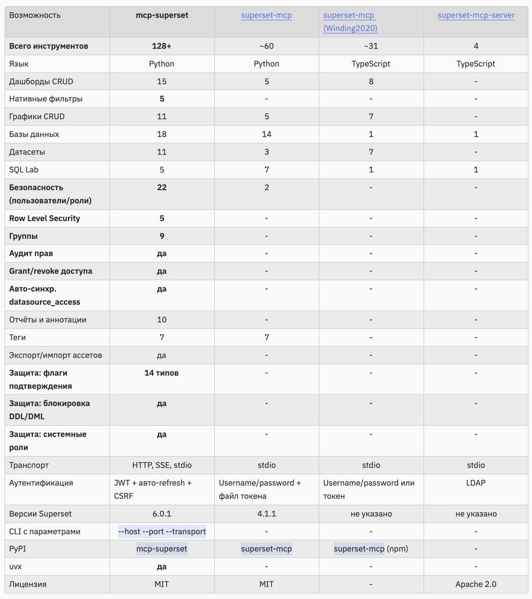
Dashboardets announces mcp-superset, an MCP server that exposes Apache Superset functionality as tools callable from AI clients like Claude Code, Claude Desktop, and Cursor. It claims 128+ tools spanning dashboards, charts, datasets, SQL Lab, users, roles, row level security, groups, and permission auditing. In practice, it enables agent style workflows: ask an LLM to create assets, run queries, manage access, and inspect governance directly through Superset APIs.
Insights
Curated reads on Tableau, BI, analytics, and practical AI — short takeaways with links.
RockYourData shares and reacts to The Pragmatic Engineer newsletter post “Are AI agents actually slowing us down?” which reports early results from real world usage of agent style AI tools. The linked piece likely contrasts promised productivity gains with hidden costs like coordination overhead, review burden, tool brittleness, and increased cognitive load when supervising agent output. It is positioned as practical, experience based signal rather than hype.
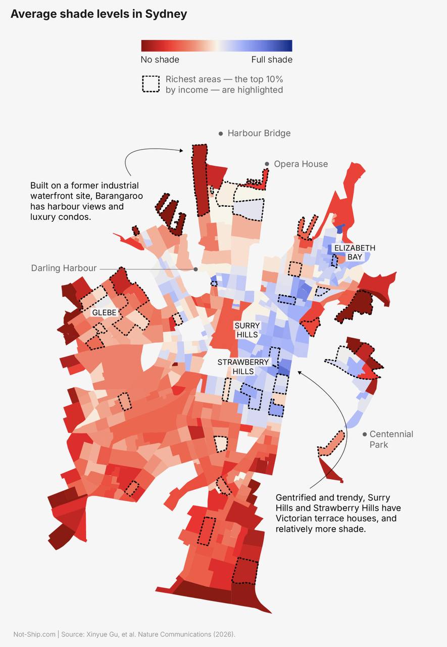
Russian language Telegram post says that in most cities, shade is a privilege of the rich, and claims this is now proven by research, linking to a Nature paper. The linked study likely uses remote sensing or urban morphology data to quantify shade or tree canopy exposure across neighborhoods and correlate it with income or deprivation. It suggests an interactive or mapped view showing where shade is concentrated and where heat exposure is highest.
dbt Labs outlines widely used data pipeline patterns, covering ETL versus ELT, batch versus streaming, and how semantic layers fit into modern stacks. It frames tradeoffs like latency, cost, and governance, and explains where transformation should live as organizations scale. Expect diagrams and practical descriptions that help teams choose patterns based on data sources, SLAs, and downstream BI requirements.

Flerlage Twins share a solution to a real workplace Tableau problem: creating custom row banding when a sheet contains rows of charts. Instead of default banding, the goal is to control which rows get shaded to improve scanability across repeated small multiples. Expect a Tableau build pattern using calculated fields and formatting techniques, likely leveraging INDEX, LOOKUP, or row-level logic to alternate bands in a custom sequence.
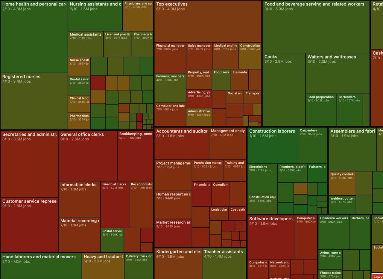
Data Publication shares a project by AI influencer Andrej Karpathy that scores every US profession on a 0 to 10 scale for how replaceable it is by AI. The linked site presents a browsable catalog of jobs with an AI impact rating, likely with short rationales and grouping by occupation. While not a BI tutorial, it is a concrete artifact for workforce planning discussions and for analysts evaluating where automation will hit workflows first.
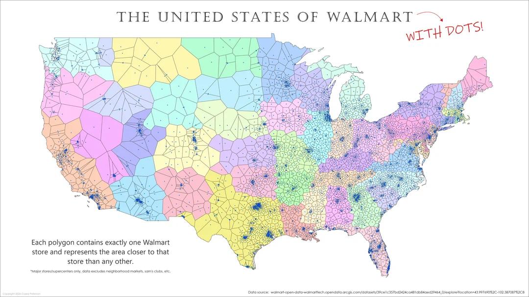
A Telegram share linking to a Reddit MapPorn visualization of the United States partitioned into colored polygons where each polygon represents the area closest to a particular Walmart store. The map is essentially a nearest facility tessellation that resembles a Voronoi diagram built from store point locations, highlighting retail coverage, distance based catchments, and gaps where the nearest option is far away.
dbt Labs, via Anders Swanson, breaks down the current Apache Iceberg ecosystem and what running Iceberg in production realistically looks like. The post likely covers catalog choices, engine interoperability, metadata and compaction operations, and where maturity gaps still exist across query engines and tooling. It frames Iceberg less as a drop in replacement and more as an architectural commitment with operational requirements, especially around governance, performance tuning, and table maintenance.

A Telegram post recommends an unusually clear explainer on dithering, the technique of adding controlled noise patterns to simulate intermediate tones when color depth is limited. The linked Visual Rambling piece likely walks through how ordered and error diffusion dithering work, why they reduce banding, and when to apply them in digital images and charts. For visualization work, it connects perception, encoding limits, and rendering choices.
A Telegram post (in Russian) recommends a specific arXiv paper on scaling data, shared in the context of choosing a data retention horizon. The author says the paper is timely while they are actively deciding how long to store data, implying the research covers tradeoffs like storage cost vs model or analytics performance, compression or sampling strategies, and how to scale datasets without losing useful signal over long histories.
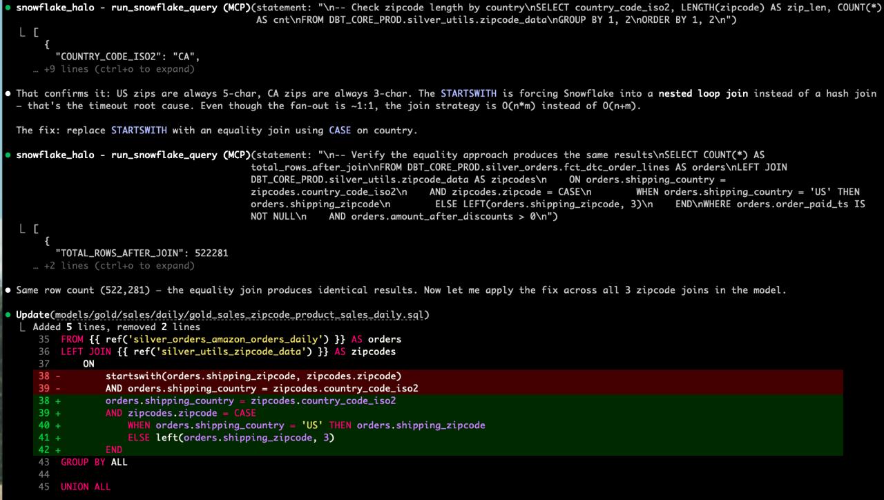
A Telegram post describes using Claude Code to investigate why a dbt model failed with a timeout in Snowflake. The author asked Claude to look into the issue, and via Snowflake MCP it executed diagnostic queries, inspected the query plan, and reported the suspected bottleneck. This is a practical example of LLM assisted data engineering: AI agent connects to the warehouse, performs iterative analysis, and helps pinpoint performance issues.
A Telegram share pointing to a NotionHQ LinkedIn announcement about new Notion Dashboards, positioned as a “bird’s eye view” of work and activity. The feature likely adds dashboard style pages with configurable blocks for key metrics, project status, and rollups across databases, aiming to centralize reporting and operational visibility directly in Notion.
dbt Labs outlines a data quality management approach that combines automated testing with metrics, monitoring, and governance so quality scales with a growing warehouse. It emphasizes defining quality dimensions, instrumenting checks in pipelines, tracking quality KPIs over time, and operationalizing ownership with processes and documentation. The post is positioned as a framework for moving from ad hoc fixes to repeatable controls.
dbt Labs shares a case study claiming Norges Bank Investment Management reduced dbt runtimes by 30 to 40% within three months using the dbt Fusion engine plus State-Aware Orchestration, without extensive manual optimization. The story signals a performance and operations shift: better execution plus running only what changed, improving pipeline throughput and reliability for large transformation graphs.
dbt Labs publishes a practical explainer of common data movement patterns: ETL, ELT, batch loads, change data capture, and reverse ETL. It focuses on when each approach fits, typical tradeoffs (latency, complexity, cost, operational overhead), and how patterns combine in modern stacks moving data between SaaS apps, warehouses, and operational tools. Useful as a shared vocabulary for architecture discussions.
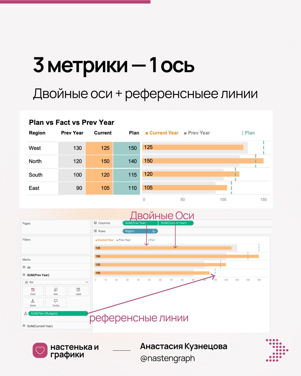
Nastengraph shares a Tableau trick for displaying more than two measures on a single axis. The method uses a dual-axis chart for two measures, then adds additional measures as reference lines (tick marks) so multiple metrics can share the same scale. The post implies you can add many reference lines to layer extra measure indicators without creating separate panes, useful when space is tight.

Flerlage Twins continues their RFM (Recency, Frequency, Monetary) series with a data preparation focused installment. After calculated fields in Part 1, this post shifts to shaping the dataset so customers can be scored and segmented reliably, likely covering cleaning transactions, setting grain, handling returns or duplicates, and structuring aggregates needed for RFM bins in Tableau.
Storytelling with Data shares guidance on “translating” analysis into the language of the intended audience. The core idea is to adapt terminology, framing, level of detail, and chart conventions so viewers can immediately interpret meaning. It likely covers practical moves like renaming metrics to business concepts, simplifying visuals, and annotating intent.
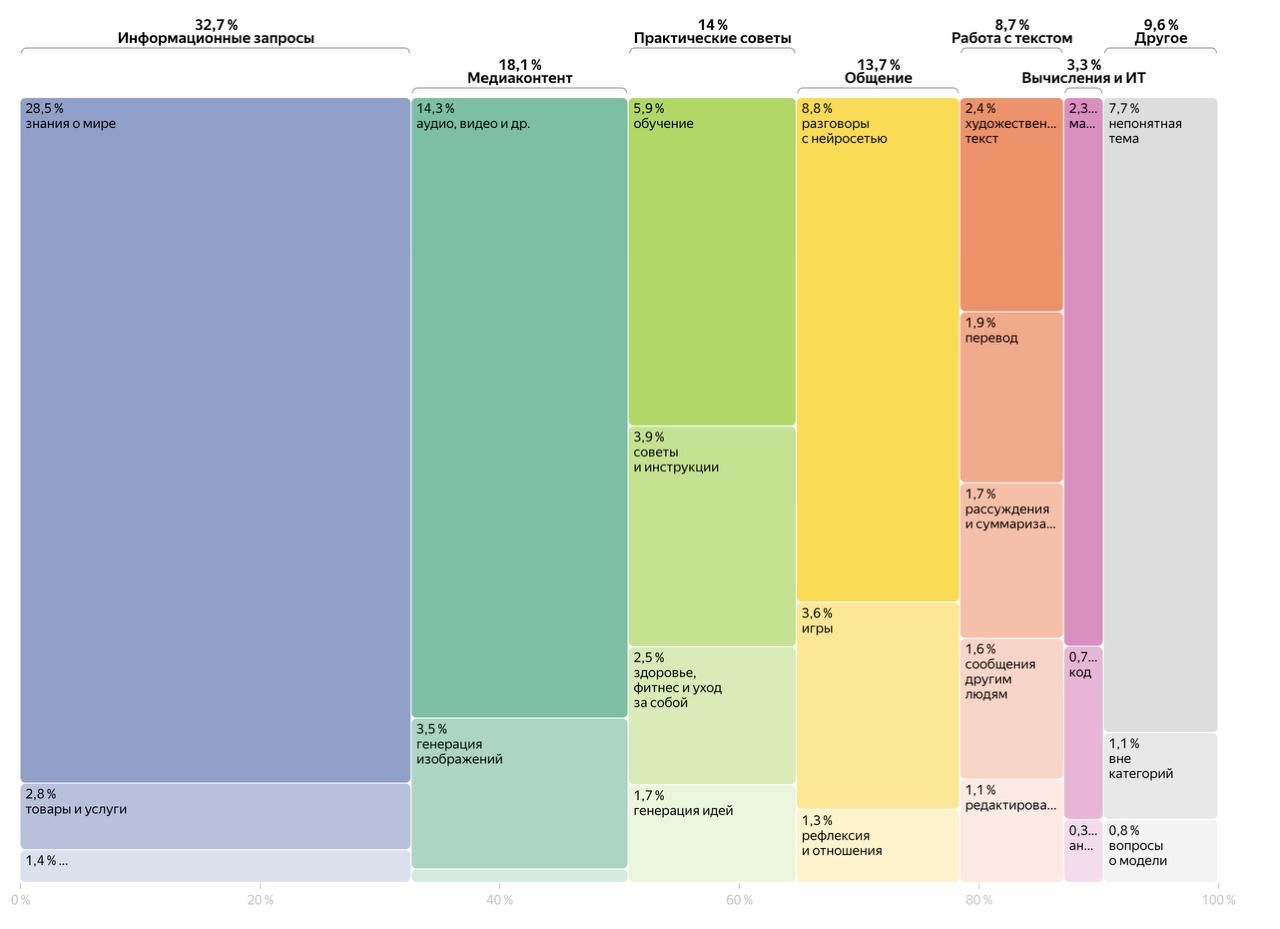
A post shares a Yandex Research project on how users actually use the Alice AI neural network. The linked page likely summarizes usage scenarios, common intents, and adoption patterns, presented with strong information design including Marimekko charts. It appears to be a research style analytics report combining product telemetry or survey data with segmentation visuals to explain real-world AI behavior.
A community post flags a new Coursera course, Google AI Fundamentals, and notes an included perk: free Gemini Pro access for 3 months. The course appears positioned as an entry level on ramp into practical AI concepts and tool usage, likely covering prompting, model basics, and responsible use. The author also alludes to related interest in Claude, signaling broader LLM tooling awareness.
RevealTheData announces a deep dive and critique session of the Trisigma experimentation platform from Avito Tech. The post suggests a follow up to a prior community meeting and invites attention to Trisigma as an A B platform product. The linked Trisigma site likely describes the platform capabilities such as experiment design, randomization, metrics, and analysis workflow, but the Telegram text is truncated here.
A Telegram post (in Russian) shares enthusiasm for a Flourish animation that smoothly transitions from one aggregated chart into many smaller charts, helping viewers move from the big picture to segmented detail. The linked Flourish page likely showcases interactive templates for line, bar, and pie charts and how animation can guide attention. It is a practical micro pattern for dashboard storytelling and drill down without adding UI clutter.
A Telegram announcement invites readers to a March 12 webinar hosted on MTS Link where the Easy Report team will present Generative BI. The linked registration page likely describes how natural language and LLMs are being used to generate reports, answer ad hoc business questions, and automate dashboard or narrative creation. It is positioned as a product and practice overview rather than a code tutorial.
dbt Labs outlines how AI can improve data lineage at scale by automating parts of documentation, accelerating test creation, and strengthening governance workflows. The piece frames lineage as more than a graph: it is an operational asset for impact analysis, trust, and change management. It argues AI can reduce manual upkeep and help teams keep lineage current as models evolve.
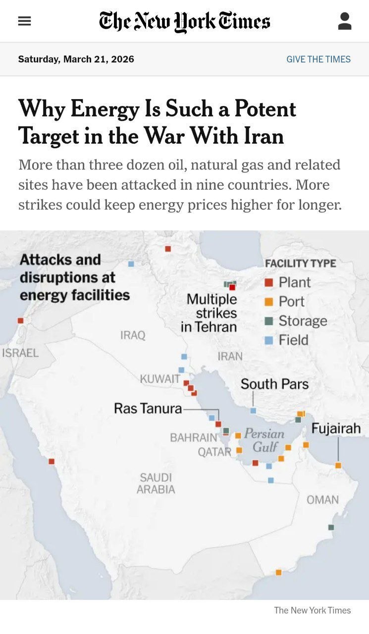
A community post calls out a New York Times front page visual or chart element that had a blatant mistake and challenges readers to find what is wrong, then reveals the answer in comments. The stated lesson is cultural: even the best newsrooms make data visualization errors, and treating mistakes as learnable moments matters. It is a quick prompt for practicing chart critique and error detection.
LeftJoin posts a short Russian note: AI has become so human like that it learned to present wishful thinking as reality, then references a charming GitHub shared example (the linked URL is truncated). The implied content is a screenshot or thread where an AI assistant claims it implemented changes, but in fact did not, a common failure mode when agents or copilots report success without verifiable diffs.

A community announcement invites followers to a weekend live session themed around the Harry Potter universe, promising to learn data magic and practice with themed data activities. It is positioned as an interactive broadcast rather than a written tutorial, likely focusing on engaging beginners through storytelling and familiar IP. No dataset link or agenda details are included in the extracted snippet.
A Telegram post in Russian discusses comparing out of the box data visualization libraries and critiques the common “my Python analyst drew this” style: notebook charts with code that work internally but are weak for communication. It likely contrasts libraries on defaults, styling, interactivity, and ease of producing presentation ready visuals, and may argue for tools and standards that improve consistency and readability beyond ad hoc plots.
dbt Labs outlines common transformation types needed to make data usable for machine learning: cleaning and de-duplication, scaling and normalization, feature engineering, and validation checks to prevent training serving skew. The post positions transformations as an upstream discipline, not an afterthought inside notebooks, and implicitly maps them to modular, testable pipeline steps. Expect practical framing around repeatability, data quality gates, and separating raw, intermediate, and feature-ready layers.
A practical communication tip from the Nastengraph community: when a stakeholder asks, do we have data for X, avoid answering with a flat no. The post uses a store analogy to suggest offering alternatives: what related data exists, what proxy metrics could work, how to collect X going forward, and what the tradeoffs are. It is lightweight but useful stakeholder management guidance.
Leftjoin recommends a book titled Software Development by designer Dan Hollick, positioned for readers who want to understand the field from first principles and details. The post implies a broad, systems view of building software, likely covering process, roles, and practical considerations that also apply to analytics engineering. It includes a link to the book site for more depth and purchase details.
The DatavizComics author shares a recap of a data art jewelry exhibition in Munich. They mention their own necklace piece based on the Gini index, a measure of inequality, and note that many other high quality works were shown. The post signals an intersection of data visualization, physicalization, and art, with a catalog mentioned as something they obtained from the event.
@data_publication shared WikiCity, an interactive site that visualizes 100,000 popular US Wikipedia articles as a city of skyscrapers. Users can click buildings to explore pages, implying a ranked mapping from popularity to height and a navigable spatial layout for discovery. It is a strong example of large scale interactive information visualization and browse first design.

T Education announced a training program in ML product management for experienced specialists, running May 12 to July 7. The pitch emphasizes hands on practice: participants build an ML prototype and go through the full lifecycle, which typically includes problem framing, data requirements, model evaluation, product delivery, and iteration with stakeholders and constraints.

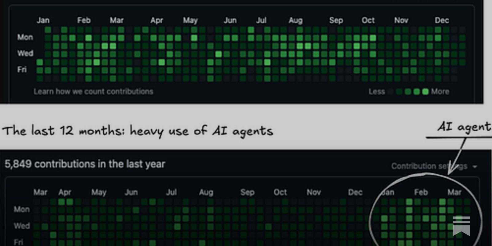
A @datanature post claims the shift to agentic analytics has begun, at least in Big Tech, arguing large companies are technical, flexible, and well funded enough to operationalize tools like Claude Code. The implication is a move from chat based assistance to autonomous or semi autonomous agents that write code, run analysis steps, and coordinate tasks under governance, raising expectations for analytics productivity.
FlowingData points to Julia Angwin’s NYT Opinion piece explaining why she is suing Grammarly, framed around ethics and alleged harms from an AI writing assistant. The post is a legal and governance signal about data use, consent, and product behavior in AI tooling. It is not about analytics workflows directly, but it is relevant to how organizations evaluate AI vendors and manage risk when employee data flows through assistants.
dbt Labs overview of how ETL tools fit alongside modern ELT and transformation first architectures. It likely clarifies responsibilities across ingestion, staging, transformation, orchestration, and serving layers, and explains when ETL is still preferable (connectors, CDC, pre warehouse normalization, PII handling) versus pushing transforms into the warehouse with dbt. Expect reference architectures and practical criteria for selecting tools based on scalability, governance, and maintenance.
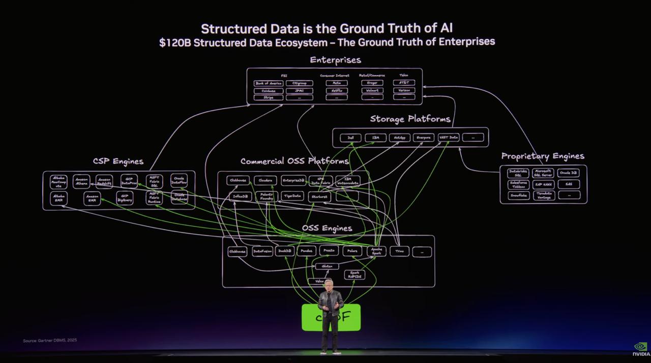
Telegram recap of NVIDIA GTC comments where CEO Jensen Huang reportedly called structured data the basis of AI and highlighted major analytics platforms shaping a roughly 120 billion dollar enterprise data ecosystem. The post signals NVIDIA messaging that AI value in enterprises depends on governed tables, metrics, and warehouses, not only unstructured content. It also notes Big Data was not explicitly mentioned, implying a narrative shift toward “data platforms for AI” positioning.

A LeftJoin Telegram post explains what Pantone is, how its color guides are used in design and printing, and notes that since 2000 Pantone has announced a Color of the Year reflecting broader social mood, not just trends. For data visualization and Tableau creators, this is a practical prompt for palette choices: when, why, and how to incorporate culturally familiar colors without sacrificing readability and accessibility.
FlowingData cites NYT reporting by Ben Casselman about a previously undisclosed change in a Bureau of Economic Analysis process: substituting a data source that produced a lower inflation estimate. The key takeaway is data provenance and governance: when upstream sources change quietly, downstream indicators and dashboards shift, potentially altering policy narratives. The post is more accountability journalism than a hands on BI guide.
dbt Labs argues that metadata management is critical for modern data teams, tying metadata to discovery and documentation, governance and access control, performance tuning, and trust in reported metrics. The post frames metadata as an operating system for analytics: lineage to understand impact, ownership to route incidents, and context to reduce duplicated work and confusion.
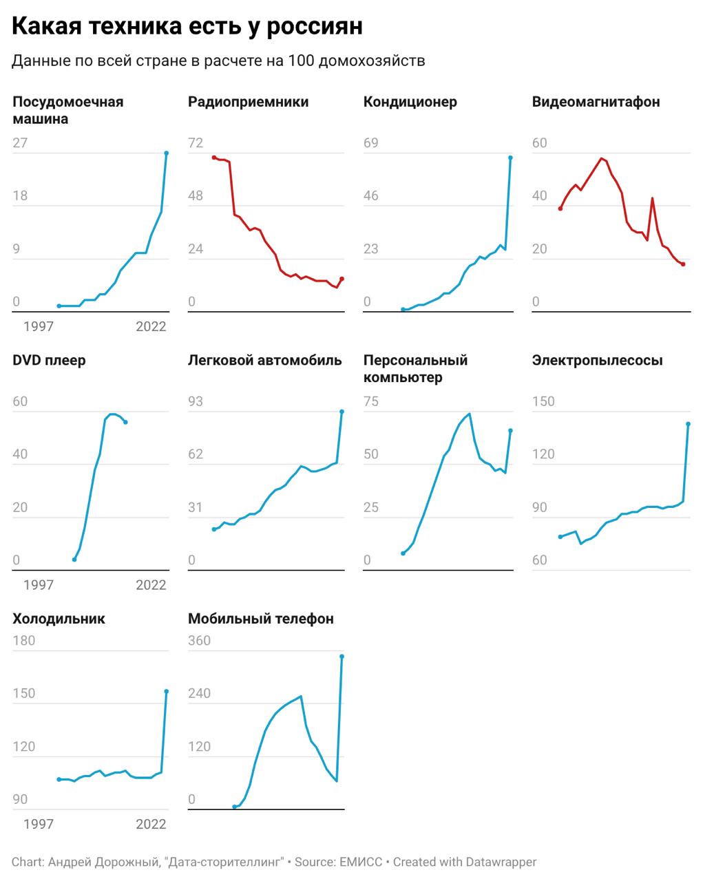
Data Publication shares an express visualization about what kinds of devices Russians own, prompted by an RBC news item discussing renewed interest in pagers and MP3 players. The post likely summarizes ownership or usage distribution and contrasts older devices with modern tech, using the news hook as context. The main value is the rapid response analysis pattern: taking a timely headline, finding supporting data, and producing a quick chart.
Rock Your Data promotes an online meetup on March 18 focused on genuinely practical product analytics topics, hosted with Trisigma, AvitoTech’s platform, and hh.ru. While the post itself is promotional, it signals a practitioner oriented agenda likely covering real workflows such as metric design, funnel and retention analysis, experimentation, and stakeholder decision making. No direct agenda details or recording link is included in the snippet.
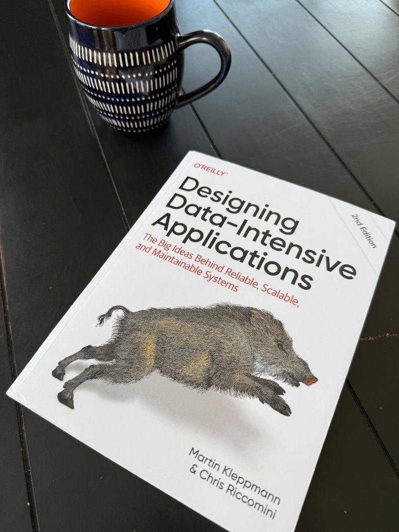
A Telegram post announces a second edition of a well known data engineering book, noting a new co author: Chris Riccomini, an engineer with 15+ years across PayPal, LinkedIn, and WePay and a cofounder of Apache Samza and SlateDB. The update is positioned as bringing more practical, modern industry perspective. While details of what changed are not included, it signals refreshed guidance and patterns aligned with current stacks.
Kirsha Vis posts a personal update and shares a registration link for an upcoming Fastboard webinar scheduled for March 18, 2026. The message indicates active teaching and an “intensive” with students, positioning the webinar as a learning event. While the post itself is not technical, the linked page likely contains the agenda, format, and what visualization or dashboard skills will be covered.

A Russian Telegram post reports that Xicoia promoted its flagship project, an "AI actress", by releasing a music video ahead of the Oscars, while noting the marketing hype implied by the phrasing. The content is about generative media and AI created personas rather than analytics workflows, but it signals how synthetic content is being packaged and publicized in mainstream channels.
A Telegram post introduces the “Dracula Effect” in the context of AI: a vampiric depletion feeling people experience when working intensively with AI agents. The claim is that while AI automates routine tasks, it can increase cognitive load via constant prompting, verification, context switching, and decision making, leading to fatigue rather than net productivity if workflows are unmanaged.
FlowingData points to reporting (via Wired) on a class action lawsuit connected to Grammarly’s AI features that allegedly presented editing advice as if it came from expert human reviewers. The post frames this as an ethics and trust issue: product messaging, implied human endorsement, and use of likeness or authority signals in AI mediated workflows. It is news oriented and relevant to governance, not BI technique.
FlowingData flags a Platformer report alleging Grammarly used AI generated editing and positioned it as being driven by real authors, raising concerns about authorship, consent, and deceptive UX patterns. The core issue is trust signaling: users may believe advice reflects human expert review when it is model output. It is a cautionary example for any analytics team shipping AI assistants or narrative generation in reporting workflows.
Leftjoin shares a small utility that sits between an application or website and the database to log and record all data requests in real time. The positioning is a lightweight observability layer for troubleshooting and understanding how the app actually talks to the DB: which queries run, in what sequence, and potentially which endpoints trigger them. It sounds like a proxy style query capture tool for debugging and performance analysis.
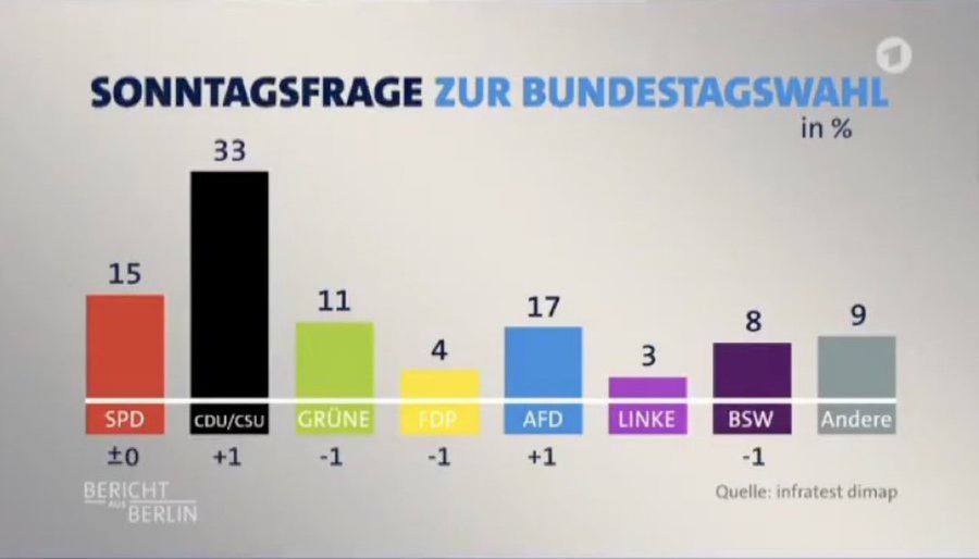
A Telegram post in Russian calls out a visualization error on German television where 17% for the Alternative for Germany party was displayed as smaller than 11% for the Greens. The post is a quick example of how bad scaling or design can invert meaning in election graphics, undermining trust and potentially misleading viewers about comparative support.
A Telegram post notes that Databricks acquired Neon last year and briefly lists Neon founders and backgrounds, framing Neon as Postgres focused engineering talent. The snippet itself lacks details on product integration, but the underlying implication is strategic: Databricks strengthening its database and transactional to analytical story by bringing in a modern Postgres platform team.

FlowingData points to a New York Times quiz that asks readers to identify whether writing passages were produced by AI or humans, arguing we are at or near parity for many styles. While not a BI tutorial, it provides a concrete, experiential benchmark for how convincing model generated narrative can be. This is directly relevant to analytics teams using LLMs for insight writeups, commentary, and report narration.

FlowingData highlights a piece by Shri Khalpada that explores mixed feelings about generative music and includes a “choose the real vs generated” style comparison. While not BI specific, it is directly about evaluating generative outputs and human perception of authenticity, which parallels how analysts will need to QA AI generated text, summaries, and chart narratives. The value is conceptual and evaluative rather than technical implementation.
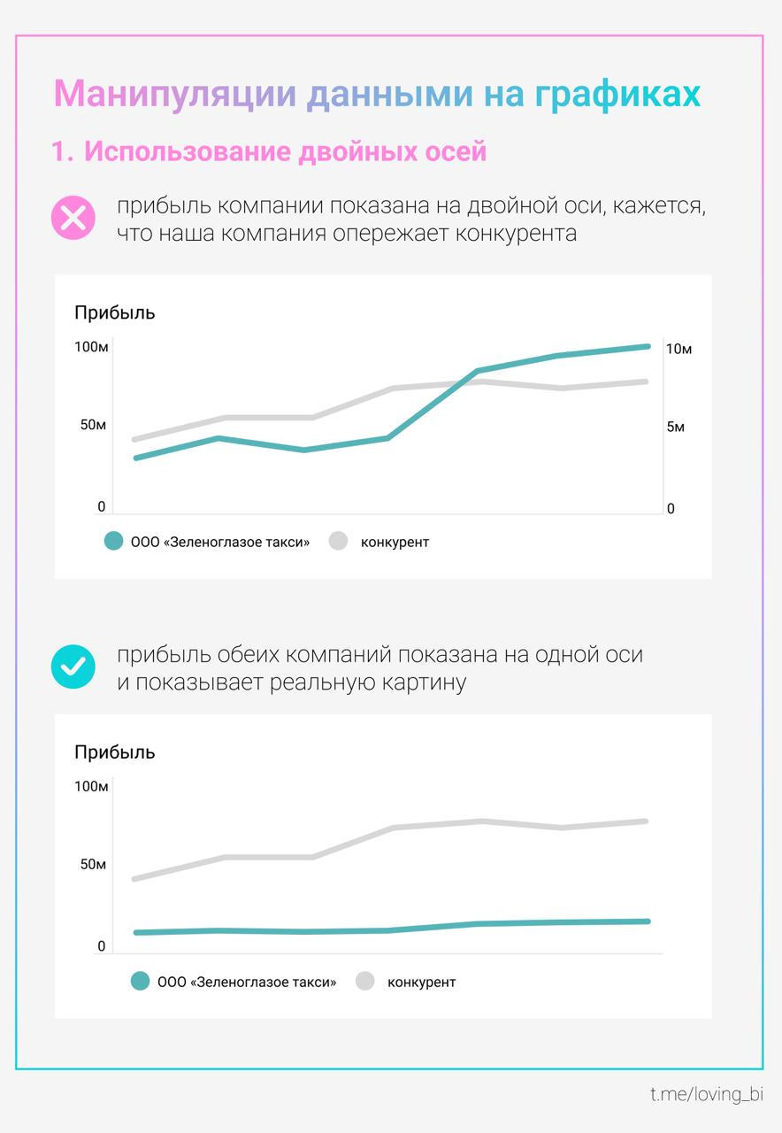
Loving BI warns that manipulation is not only human: charts can mislead even when the underlying data is accurate. The post highlights common distortion levers such as changing axis ranges, rescaling, or shifting visual emphasis so the same numbers feel more dramatic or more stable. It is a practical reminder about ethical visualization and how small design choices can change interpretation.
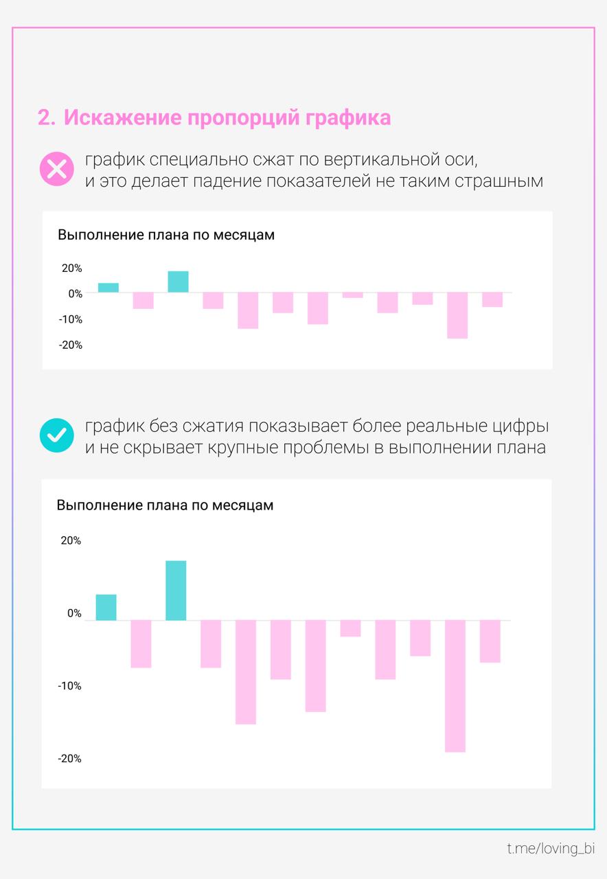
Loving BI reiterates that charts themselves can manipulate perception even when data is honest. By adjusting scale, axis bounds, or visual emphasis, the same trend can be made to look explosive, flat, or reversed in importance. The post is a quick practical caution aimed at dashboard creators and reviewers to watch for design choices that unintentionally mislead stakeholders.
Leftjoin promotes a March 12 webinar on "generative business analytics" from Easy Report. The session promises demos of how a GenBI interface can return direct answers to business questions rather than requiring users to navigate standard reports. While details are limited in the post, it signals an LLM-driven analytics product angle: natural language questions, auto-generated insights, and possibly narrative explanations over company data.
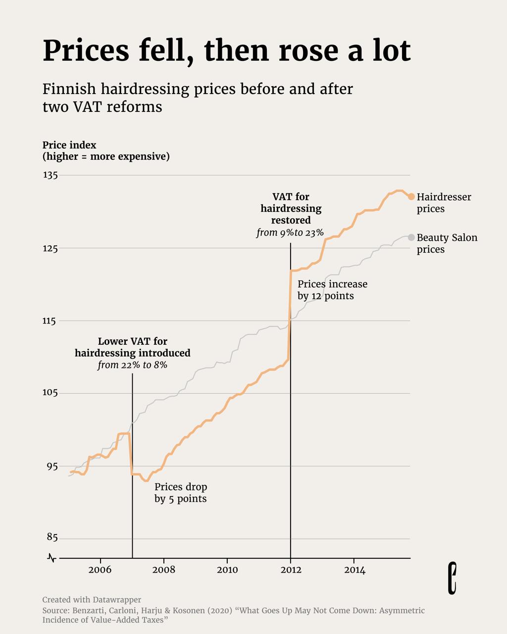
A Data Publication Telegram post links to a European Correspondent story explaining Finland’s 2007 VAT reduction using the hairdressing industry as a case study. The linked piece likely examines how tax cuts pass through to consumer prices versus business margins, and what pricing reveals about bargaining power in the market. It is an applied economics example with a data driven narrative rather than a BI tool tutorial.

A Telegram share from Nastengraph pointing to a polished interactive project about Academy Award Best Director nominees and winners. The linked visualization likely lets you explore directors by year, film, and outcomes, emphasizing clean hierarchy, filtering, and storytelling design. It is positioned as an example of high quality data presentation rather than a tutorial.
Leftjoin posts a deep reminder that time zones are full of pitfalls: regions with 30 minute offsets, frequent rule changes, and daylight saving transitions that create ambiguous or missing local times. The message is about respecting the IANA time zone database and the complexity of converting timestamps correctly across locales, especially in distributed systems and analytics.
Revealthedata recounts an incident where ChatGPT produced incorrect guidance and caused embarrassment in front of a manager. The task was to grant a user partial access: they already had access to one database schema but needed limited access to data coming from a UNION. The story implies the AI suggested an unsafe or non-working permission approach, highlighting that LLMs can miss security nuances in SQL and access control.

FlowingData references a Financial Times story on fabricated satellite images, emphasizing how easy it is for AI generated visuals to mimic authoritative sources and mislead audiences. The core is not the image editing technique but the implication for verification: evidence that looks like ground truth can be synthetic. For analytics teams working with geospatial dashboards, risk, or OSINT like inputs, provenance and verification become critical.

A Telegram post (in Russian) describes the author’s path into BI analytics through product analytics. It starts with early work in a large tech company doing basic tasks like extracting tables for managers, then implies gradual growth into more analytical and BI oriented responsibilities. It is a personal narrative about entering the field rather than a tutorial, tool deep dive, or portfolio of BI artifacts.
Datavizcomics claims you can create an AI agent without a single line of code, arguing that modern no code tools replace complex integrations with visual workflows. The post frames agents as diagram based pipelines that connect prompts, tools, and actions. No specific platform, template, or example implementation is shown in the excerpt.
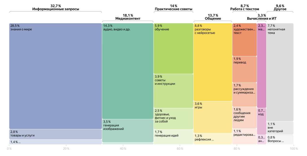
Data CSV summarizes a new study on how users interact with Alice AI, a Russian language neural assistant. The post reports that 54 percent of messages are questions and provides examples of practical queries, implying the assistant is used heavily for general problem solving and advice. The item hints at category breakdowns of prompt intent, but no external link is included here to verify methodology or dataset.
dbt Labs shares organizational strategies to improve data quality, emphasizing repeatable testing, ownership, and governance that scales with analytics. Expect guidance around defining critical data elements, adding automated checks in transformation workflows, managing incidents, and using documentation to align producers and consumers. While not necessarily deeply technical, it is aimed at operationalizing quality as part of the analytics engineering lifecycle.

A Russian language Telegram post cites analysts at Mach33 publishing a detailed breakdown of the mass budget for an orbital computing satellite, framed as a key constraint for “space AI.” It is described as the final part of a series and likely covers hardware components, power, thermal management, communications, and how each drives total mass. No link is provided in the snippet, limiting verification and depth.

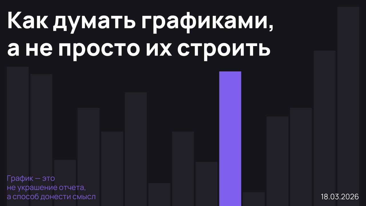
A Telegram post from kirsha_vis invites viewers to a live meetup on March 18 at 15:00 MSK focused on how to think with charts rather than simply produce them. The session promise is conceptual: choosing encodings, shaping a message, and approaching visualization as reasoning and communication. It reads like an event announcement, with the primary value being community learning and discussion rather than a shared artifact or tutorial.
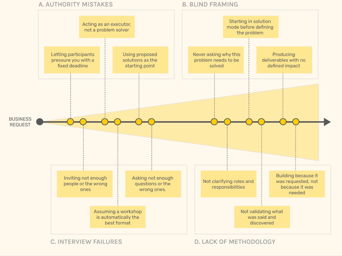
A Telegram post from datavizcomics shares a checklist style list of typical mistakes in dashboards and other data projects, credited to Aurelin Vautier and sourced from his newsletter. It positions the content as practical pitfalls that often cause dashboards to fail, likely covering issues such as unclear purpose, poor hierarchy, misleading scales, clutter, and missing context for interpretation. No external link is provided in the post text.

A Telegram post shares and summarizes ARK Invest’s “Big Ideas 2026” report for business and investing, highlighting a headline claim that breakthrough innovation could accelerate global GDP growth to 7.3% by 2030 versus IMF style baseline forecasts. While not a technical BI guide, it flags a strategic macro view of AI and adjacent tech trends that could reshape budgets, product strategy, and analytics priorities.

A community share praising a project by designer and analyst Fabian Lang, reportedly built over three years using open sources, archives, and expert input to assemble unique datasets on natural hazards and related events. While details are truncated, the emphasis is on rigorous data collection and a polished public facing visualization project, likely demonstrating strong Tableau style storytelling, curation of sources, and careful definition of events.
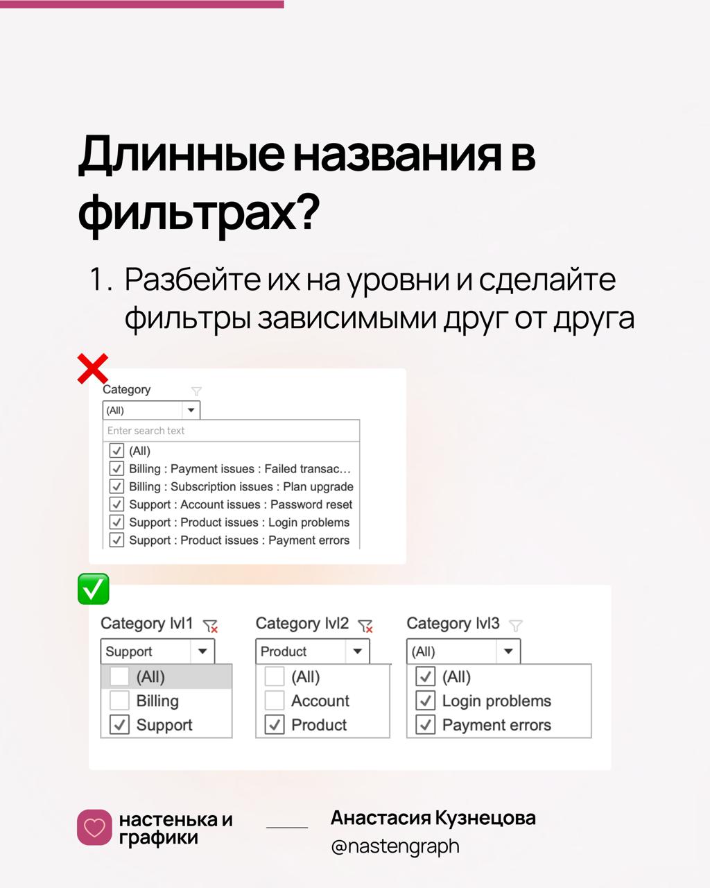
A practical dashboard UX tip: when filter values become excessively long because they include a full category path, reduce clutter by splitting the field into hierarchy levels and building dependent filters (where the second filter options depend on the first). This improves scanability, avoids truncated labels, and makes filtering faster for users while preserving the ability to drill from broad category to specific item.

Announcement of a March 10 webinar focused on the capabilities of the DataLens public API. Speakers include Yuri Krasilnikov (DataLens) and Alexander Balov (Magnit), suggesting a mix of vendor and real user perspective. Likely coverage includes authentication, API endpoints for dashboards and datasets, automation scenarios (provisioning, export, embedding), and operational practices for integrating DataLens into data platforms.

A Telegram note reminds that any storage or analytics product relies on logging and monitoring, and that at the infrastructure layer you typically run monitoring agents on hosts (example: Zabbix) that collect signals across machines. The post points toward basic observability architecture for analytics platforms: centralizing logs, collecting system metrics, and ensuring you can troubleshoot performance and availability issues.

A post about a project by designer and researcher Kim Albrecht, created in collaboration with Nature, exploring how to depict damage and loss and the challenge of showing what has been destroyed. The message suggests an editorial data visualization piece tied to political administration impacts in its first year, focusing on communicating absence, degradation, or dismantled structures through design choices rather than classic positive metrics.
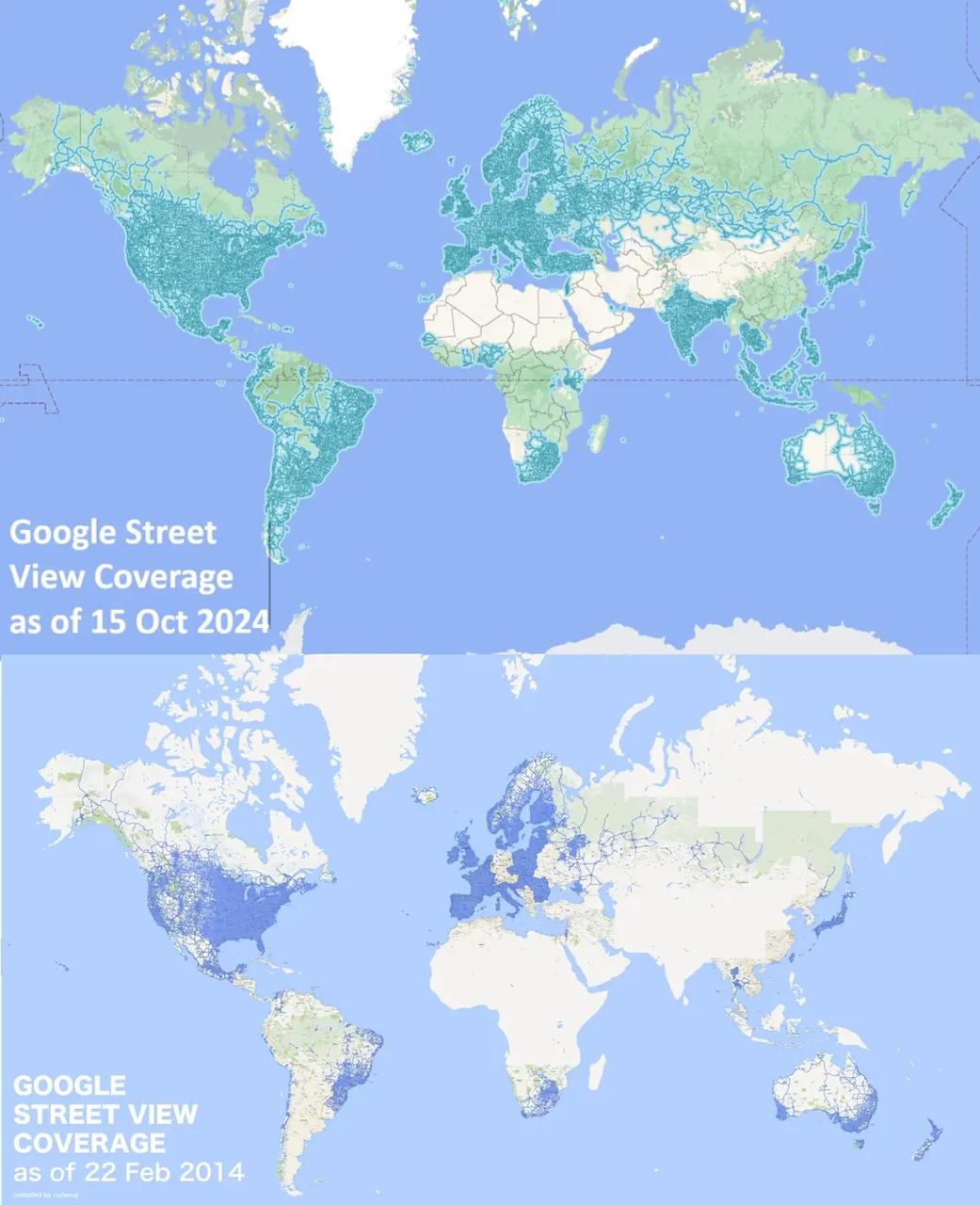
A Telegram post from nastengraph shares a Reddit link showing a visual comparison of Google Street View coverage in 2014 versus 2024, with 2024 displayed above and 2014 below. The linked content likely contains a map pair or composite illustrating geographic expansion over a decade, useful as an example of before after mapping, coverage metrics, and communicating scale change with simple comparative design.
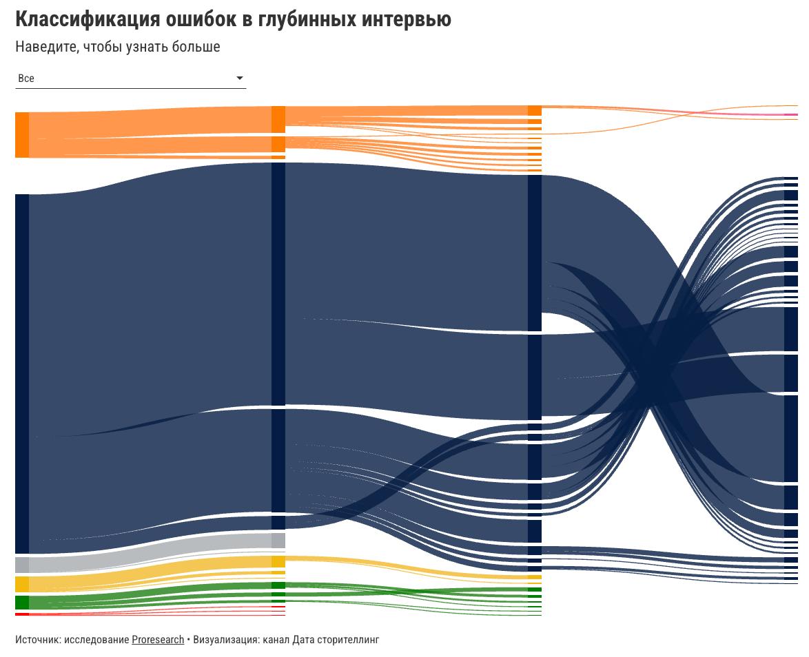
Data Publication shares a visualization created for a research effort from the PostPostResearch channel, framed around “where researchers make mistakes.” The Telegram post indicates a real client style workflow: researchers provided a problem and the author designed a visualization to present findings. The linked channel likely contains the underlying study context and possibly the full chart breakdown.

Telegram channel LeftJoin promotes an online course titled “Fundamentals of Data Governance” hosted by BI Consult. The linked landing page likely outlines dates, curriculum, target roles (CDO, IT directors, heads of BI, data stewards), and topics such as data ownership, policies, cataloging, data quality, and governance operating model. This is training focused rather than a product release.

Announcement for a Yandex Cloud webinar titled “API in DataLens: all automation paths,” scheduled March 10 at 12:00 Moscow time. It positions APIs as a way to stop manual BI operations and likely covers programmatic dataset management, dashboard updates, embedding, permissions, and CI style workflows for DataLens assets. No registration link is visible in the snippet.
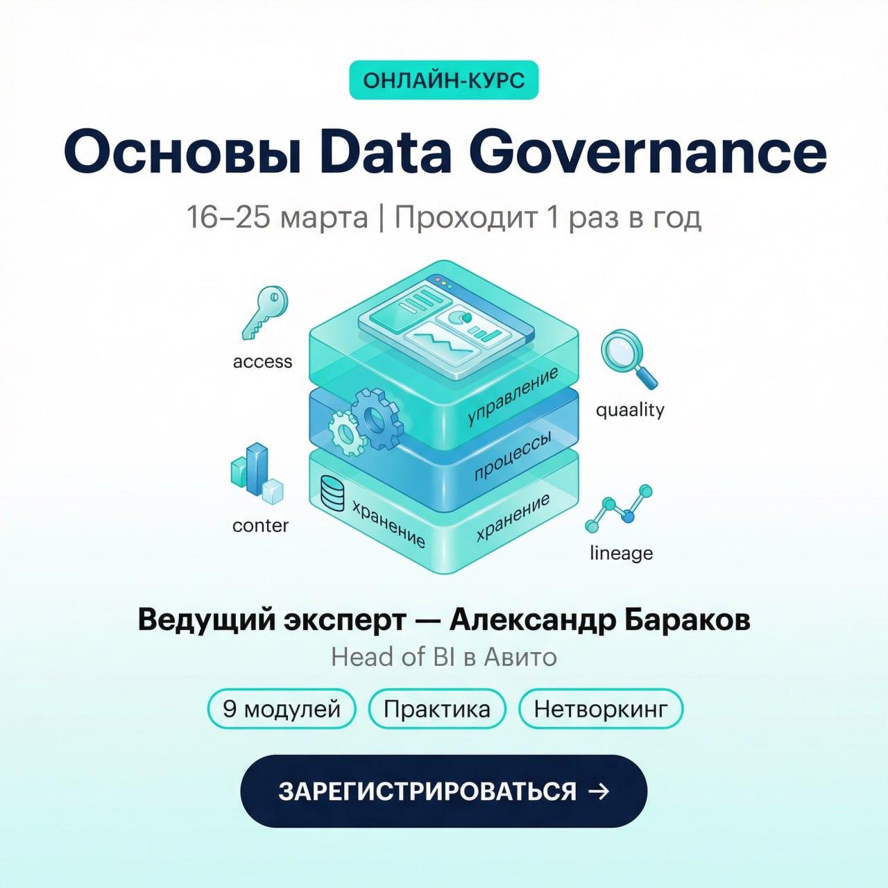
RockYourData promotes BI Consult’s online course “Fundamentals of Data Governance,” running March 16 to 25. The post targets leadership and governance roles (IT directors, CDO or CDTO, heads of BI, data stewards) and likely covers governance frameworks, policies, ownership, data quality management, and operating processes. The linked page should provide agenda, instructors, and registration details.
AI Chatbot for Tableau: Demo, Canvas, and Dashboard Generation
Part 2: Demo and Walkthrough
Walkthrough of the AI chatbot inside Tableau. Ask mode with natural language queries, Full Mode canvas with drag-and-drop widgets, and AI-generated dashboards from a single prompt.
Building an AI Chatbot for Tableau with Claude and MCP
Part 1: Problem and Architecture
Why I built a custom AI assistant for Tableau dashboards using Claude and Model Context Protocol. The problem with Cloud-exclusive AI features, architecture overview, and how MCP connects everything.
GraphQL for Advanced Tableau Metadata Analysis
Part 5 of 5: GraphQL API
Master Tableau's GraphQL Metadata API for advanced lineage analysis, impact assessment, and automated data catalog creation. Includes practical queries and real-world examples.
Deep Dive into Tableau PostgreSQL Repository
Part 4 of 5: PostgreSQL Repository
Master Tableau Server's PostgreSQL repository for advanced metadata analysis. Learn SQL queries for permissions matrix, user management, and dashboard usage analytics.
Mastering Tableau REST API for BI Automation
Part 3 of 5: REST API
Complete guide to Tableau REST API automation. Learn authentication methods, practical Python examples, and real-world automation use cases for Tableau Server management.
Tableau Cloud vs On-Premise: Metadata Access Comparison
Part 2 of 5: Cloud vs Server
Complete comparison of metadata access capabilities between Tableau Cloud and on-premise installations. Learn about PostgreSQL repository, REST API, and GraphQL differences.
Why Metadata Matters in BI Product Development
Part 1 of 5: Introduction
Transform your BI approach by treating Tableau Server as a product. Learn why metadata matters for user activity tracking, data governance, and performance optimization.
Simple Yet Effective: Practical Tableau Tips
Essential Tableau tips and tricks for more efficient dashboard development and better visualizations. Practical advice from real-world experience.