Simple Yet Effective: Practical Tableau Tips
Style guide, dashboard template, and ten tricks I use every week
This is the companion text for my live talk at the Serbian Tableau User Group. I walked through the small set of conventions and custom features that make our internal BI product feel consistent — a style guide, a single dashboard template, a few interaction tricks, and a feedback loop. None of it is rocket science. The point is that disciplined, repeatable patterns compound: every dashboard becomes faster to build and easier to trust.
Originally published on Medium.
The plan
- Style Guide — what it is and why it pays off
- Dashboard Template — the file we start every workbook from
- Tabs — default vs custom
- Question Mark — quick reference and guided navigation
- Dynamic Zone Visibility
- Filter icon — left-side filter container
- Feedback form — Google Forms for CSAT
- Tricks — custom formatting, dealing with unwanted selections, alignment crutch
Style Guide
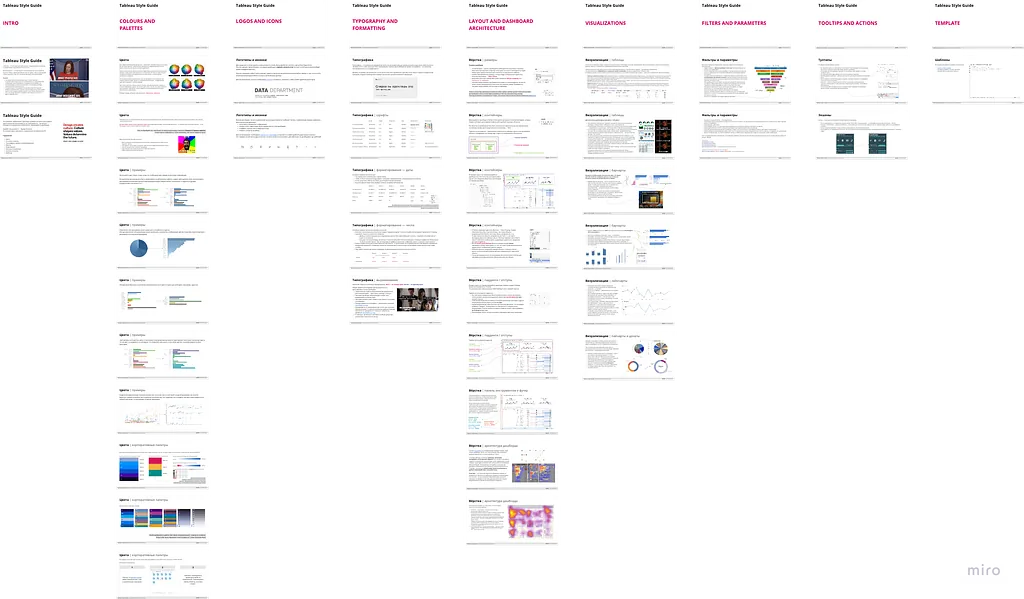
A Style Guide is our main regulatory document. It defines the appearance and standardization of all BI reporting — a collection of strict rules, flexible recommendations, and general thoughts on how a good dashboard should look.

Ours is quite extensive; I don’t claim it’s the only way to implement one, and certainly not the best of its kind. It started as an educational resource for new BI developers and grew over time. The sections we settled on:
- Colors and palettes
- Logos and icons
- Typography and formatting
- Layout and dashboard architecture
- Visualizations
- Filters and parameters
- Tooltips and actions
Why we keep one
- Consistency. Helps users focus on the information presented and saves them time understanding any new dashboard.
- Trust. Standardization increases confidence in the reports and in our department as a service team — there’s a baseline of quality every BI product clears.
- Time saving. Most basic decisions (palette, paddings, header height, footer block) are already made — developers spend their effort on the analysis instead.
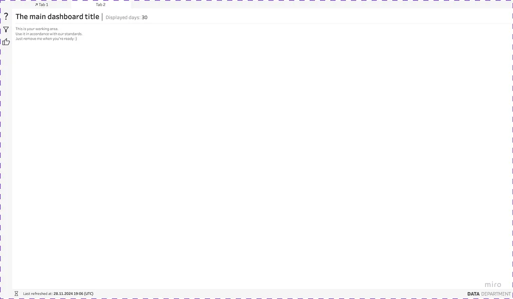
The most important point: the bulk of those rules is already consolidated in a single file — the template in a Tableau workbook. The style guide is the manual; the template is the enforced default.
Dashboard Template
We have only two versions of the template:
- Single Dashboard Template — for one-page workbooks.
- Multi-Dashboard Template with custom Tabs — for workbooks with several dashboards.
Single Dashboard Template
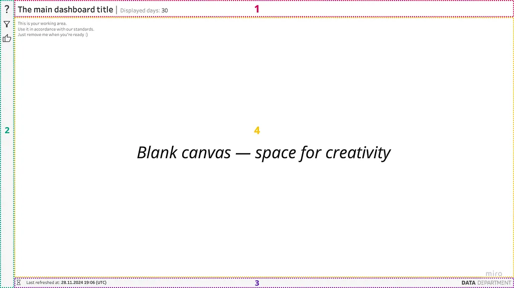
Four zones, fixed positions:
- Title and extra info — the headline and any contextual badges (filters applied, period, owner).
- Control Panel — buttons, hints, the question-mark icon, the feedback button.
- Footer — last refresh time and our department logo.
- Main content area — the actual visualizations.
Tabs
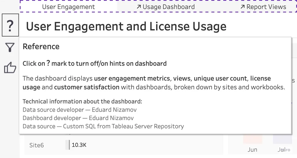
The multi-dashboard template adds a strip for custom Tabs.
Why custom and not default?
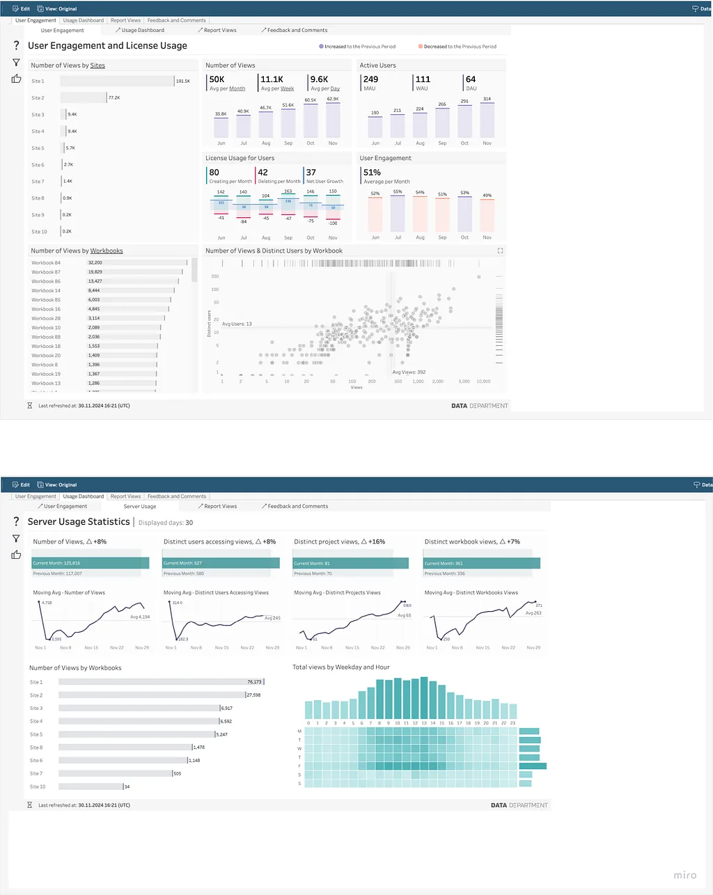
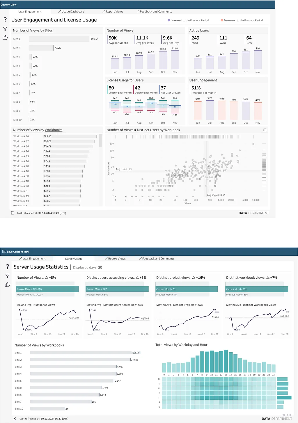
Default Tabs synchronize all dashboards in the same workbook to one size — and that means redundant white space around any dashboard whose layout doesn’t match the largest one.
With default tabs on — empty white space frames every dashboard:
With default tabs off and our own tab strip:
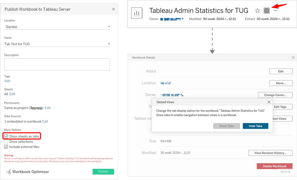
You can configure the show/hide tabs option in two places: at publish time, or directly on Tableau Server.
Question Mark
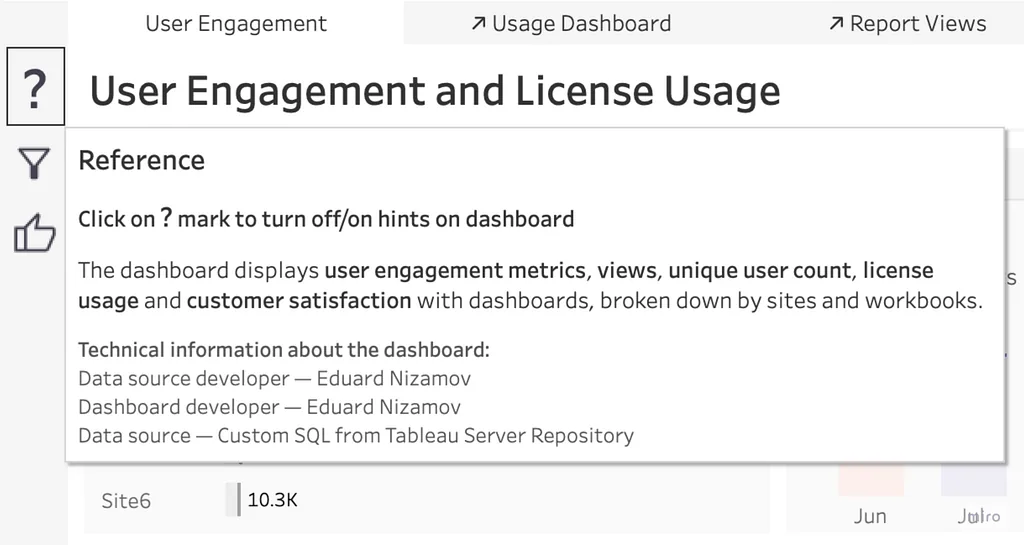
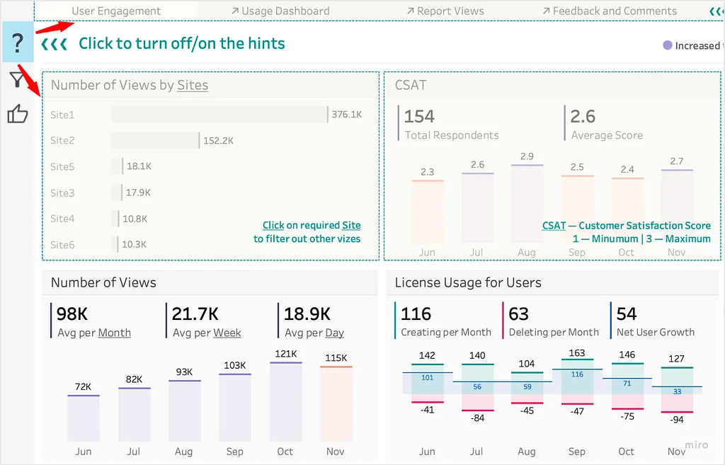
The question-mark icon lives in the Control Panel and serves two functions.
On hover — quick access to general information, the “What” function:
- Business purpose
- Logic (formulas)
- Tech information / ownership
On click — the “How” function, helping users figure out how to use the dashboard:
- Guided navigation
- Enhanced understanding (annotations, walkthroughs)
Dynamic Zone Visibility
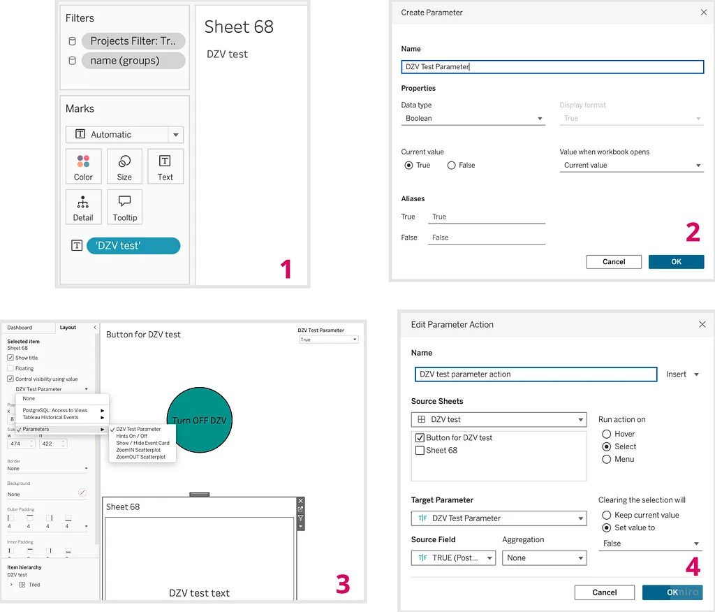
Both the question mark and several filter behaviors below are powered by the same Tableau feature: Dynamic Zone Visibility, which lets you control the visibility of dashboard elements based on a condition.
Short instructions:
- Create a worksheet that you want to display dynamically on the dashboard.
- Create a parameter or a calculated field that returns
TRUEorFALSE. - Add the worksheet to the dashboard and configure its layout by setting ‘Control visibility using value’ to the parameter or calculated field you created.
- If necessary, add a parameter action that modifies the parameter controlling visibility.
Filter icon
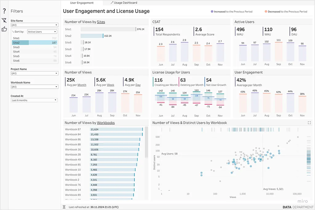
We place the filter container on the left side of the dashboard, hidden by default and accessible by clicking the filter icon.
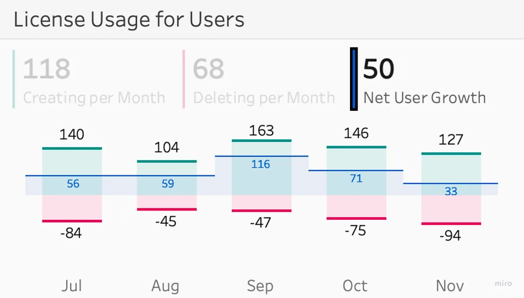
Besides the usual filters, there’s a small but highly appreciated feature: a small table configured as a filter that lets users switch the active measure. While it’s perceived as a filter, it already provides a quick insight at a glance.
Here’s a live example — User Engagement and License Usage, part of my Tableau Adoption set of dashboards used to manage our BI product.
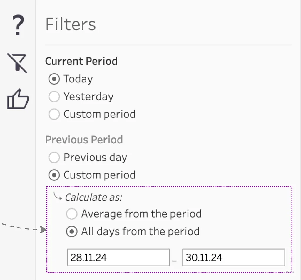
We also use Dynamic Zone Visibility here, to enhance interactivity and let users customize periods based on their specific business needs. The extra section appears or disappears depending on the option selected in the parameter above — we hide elements until they are needed and keep the UX clean while still offering a wide variety of actions.
Customer Satisfaction — Feedback form
When users click the Feedback button, it opens a Google Form with a few questions tied to the specific dashboard they’re on.
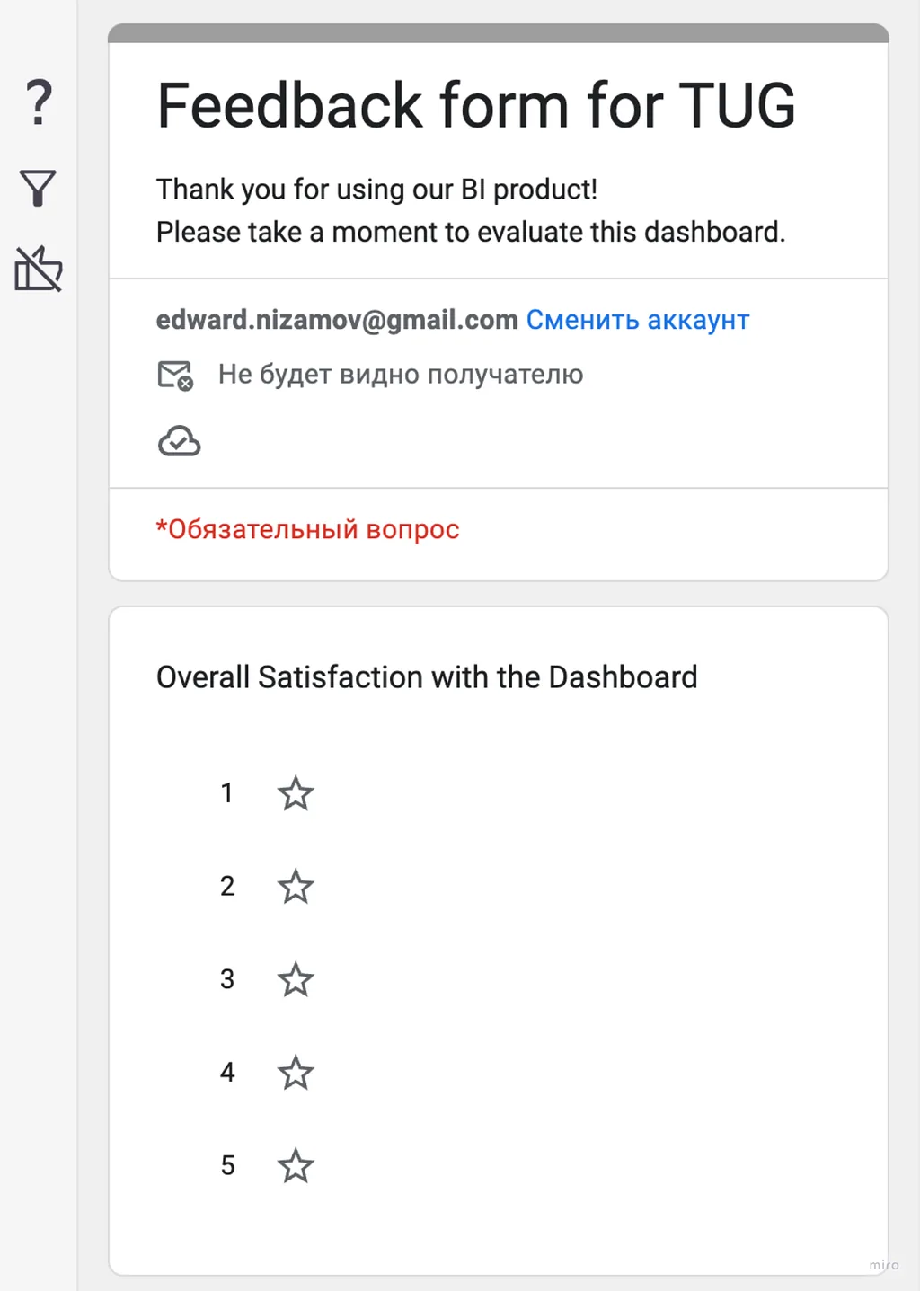
Why this matters
Referring back to my previous TUG presentation on developing BI as a product:
- We can measure product metrics like Engagement, MAU/WAU/DAU, and view counts in different segments — these are the quantitative data points we collect via the REST API or the Tableau repository on on-prem Server.
- For an objective picture, we also need direct customer feedback — the qualitative signal. The form fills that gap and lets us track CSAT.
How to set up the pre-filled form
- Create a Google Form.
- Add questions with free-text format (mark them obligatory).
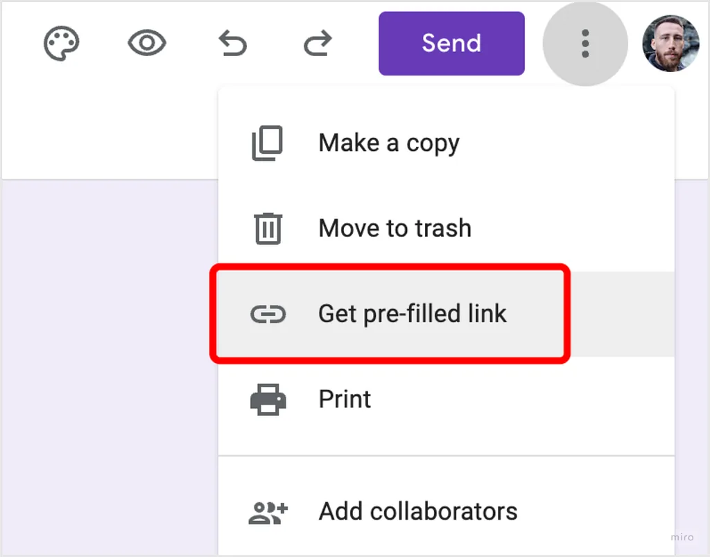
- Three-dot menu → Get pre-filled link.
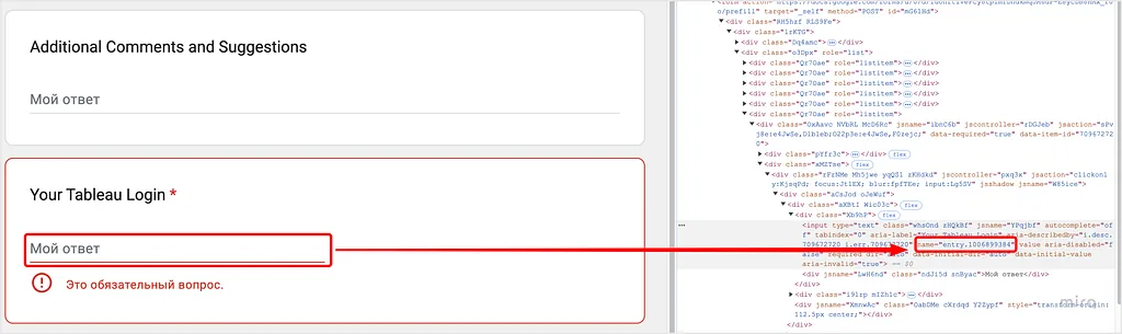
- Inspect the input element you want to pre-fill.
- Find its ID by looking for
entry.in the HTML. - Take the original form link, append
?usp=pp_url, then add&entry.{id}=<value>for each field. - Add a Web Page element on the dashboard and paste the resulting URL, equating the parameters to the corresponding entry fields.
Live example URL (formatted for readability):
https://docs.google.com/forms/d/e/<FORM_ID>/viewform
  ?usp=pp_url
  &entry.1006899384=<Full Name>
  &entry.2130746963=<Workbook Name>, <Sheet Name>
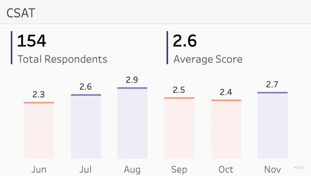
Once feedback lands, connect the dashboard to the responses Google Sheet and you can compute and track the CSAT score over time:
Bonus — pass dashboard context into the form
You can also pass any required data through Tableau parameters and capture comments from users tied to the exact element they were looking at. For example, pass the selected State and store the user’s comment against that exact row — try it on Tableau Public.
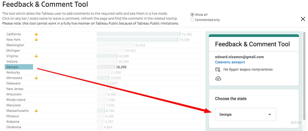
Tricks in our dashboards
Trick 1 — Custom formatting for period-over-period
We often need to compare the current period with the previous period, and stakeholders prefer to see the percentage difference. We display them in a few ways but always with red/green indicators:


How it works
Tableau’s custom formatting for continuous fields is divided into two sections by default — positive and negative — separated by a semicolon. There’s also a third section for nulls.
Format pattern:
positive_format ; negative_format ; null_format
A few patterns we use:
#,##0.0;-#,##0.0          // plain signed number
▲ +0.0%;                  // positive only — green field
; ▼ -0.0%                 // negative only — red field
To color positives green and negatives red, we keep them in two separate fields (% diff — green shows only positives, % diff — red shows only negatives) and stack them. Each field gets only one of the two format halves filled in, so the other half is invisible:
green field   →   ▲ +0.0%;
red field     →   ; ▼ -0.0%
Trick 2 — Dealing with unwanted selections
You’ve likely run into this: a user accidentally clicks an element on a chart and can’t reset that selection. Click anywhere — nothing helps. Click the same element again — still selected.
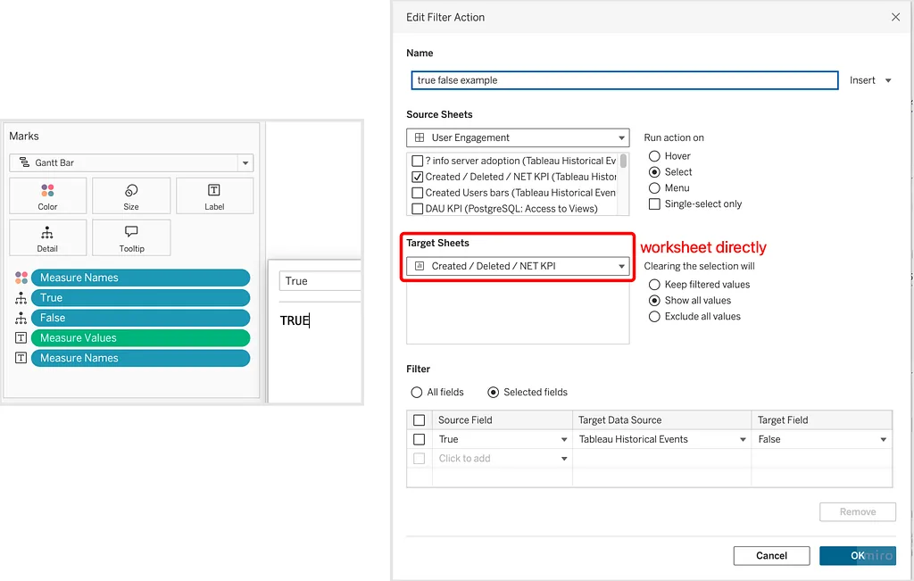
The fix is a one-line action filter that toggles the selection from TRUE to FALSE on every click, so clicking anything effectively means deselect.
Setup
- Create two calculated fields: one returning
TRUE, one returningFALSE. - Add both to the Detail shelf of the worksheet.
- Create a new Action Filter:
- Source sheet — your worksheet from the dashboard.
- Target sheet — the worksheet directly (not a dashboard zone — the raw worksheet).
- Run on — Select.
- Filter on — Selected fields.
- Source field —
True. Target field —False.
Trick 3 — Alignment crutch
You’re likely familiar with this situation: a header lives in a separate worksheet and you align it with the underlying worksheet on the dashboard. The careful layout instantly breaks when the number of rows in the lower worksheet changes due to filtering — the scrollbar appears, columns shift, and the header no longer matches.
Working example on Tableau Public.
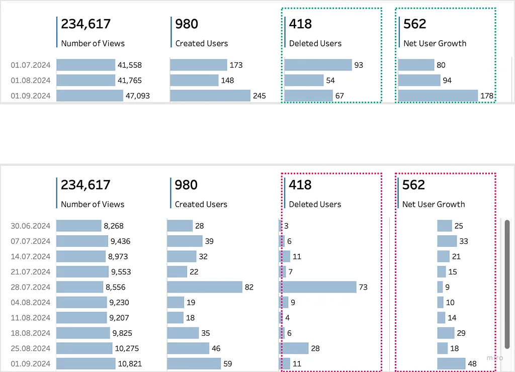
Setup
Duplicate the lower worksheet.
Remove all fields except your dimension in Rows.
Create a calculated field
Row counter:WINDOW_COUNT(COUNTD([Granularity])) + 1It counts rows depending on any filtration.
Granularityis your dimension.Create another calculated field
Counter Crutch TF:IF [Row counter] > 14 THEN TRUE ELSE FALSE ENDUpdate the number
14to match how many rows you can see without a scrollbar in your layout.Put
Counter Crutch TFin the Filters section of the duplicated worksheet and keepTrue.Move the duplicated worksheet onto your dashboard.
Set it to Fit Height on the dashboard.
While Marks is
Textand column width isStandard, hide the dimension header.Turn off all paddings.
Adjust the cell width so it lines up with the table on the dashboard.
Change Marks:
Text→Polygons.
Wrapping up
Used features:
- Style Guide — what and why
- Template with built-in elements
- Custom tabs
- Question-mark quick-reference button
- Guided navigation via Dynamic Zone Visibility
- Filter container on the left
- Customized crosstab as a filter
- Dynamic Zone Visibility for additional filters
- Google Form feedback for CSAT metrics
- Custom formatting for positive/negative indicators
- Action-filter trick for unwanted selections
- Alignment crutch for headers
If you want to dig into the BI-as-a-product mindset behind all this, the metadata series covers the analytical foundation — why metadata matters, the REST API, the PostgreSQL repository, and the GraphQL Metadata API on which the quantitative side of CSAT measurement depends.
Find me on LinkedIn.