AI Chatbot for Tableau: Demo, Canvas, and Dashboard Generation
Part 2: Demo and Walkthrough
Ask Mode
The extension is embedded in a Tableau dashboard alongside the standard Superstore datasource (the one bundled with every Tableau installation). Through Full Data Access (a permission mechanism in the Extensions API), it picks up which datasources are available and passes that context to the AI.
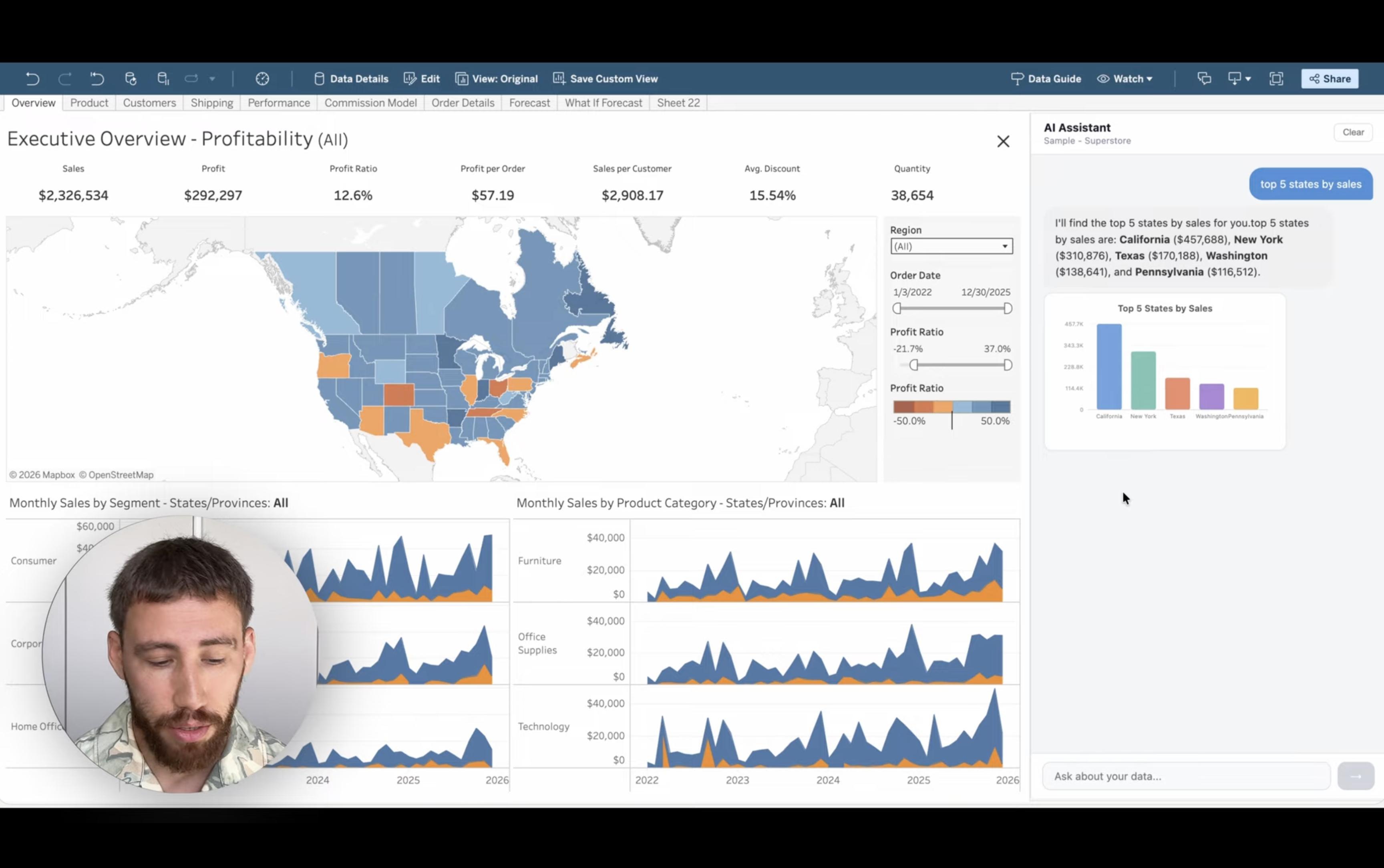
A question like “Top 5 states by total sales” returns a horizontal bar chart with California, New York, Texas and the actual sales figures from the datasource. “Monthly sales trend for the last year” produces a line chart. The model picks the visualization type based on the nature of the question. Every number comes from a real query through MCP, not a hallucination.
This is NLQ (Natural Language Querying) in practice. No worksheets to build, no fields to drag. The AI also responds in whatever language you write in, whether that’s English, Russian, or German.
Full Mode and the Canvas
The extension also supports a second layout. To activate it:
- Open the dashboard in Web Edit mode.
- Select the layout container with the original sheets.
- Pull out the Show/Hide button (a standard Tableau feature for layout containers) and click Hide. The sheets container collapses and the extension fills the screen.
- Open the extension’s settings via the gear icon and enable Full Mode.
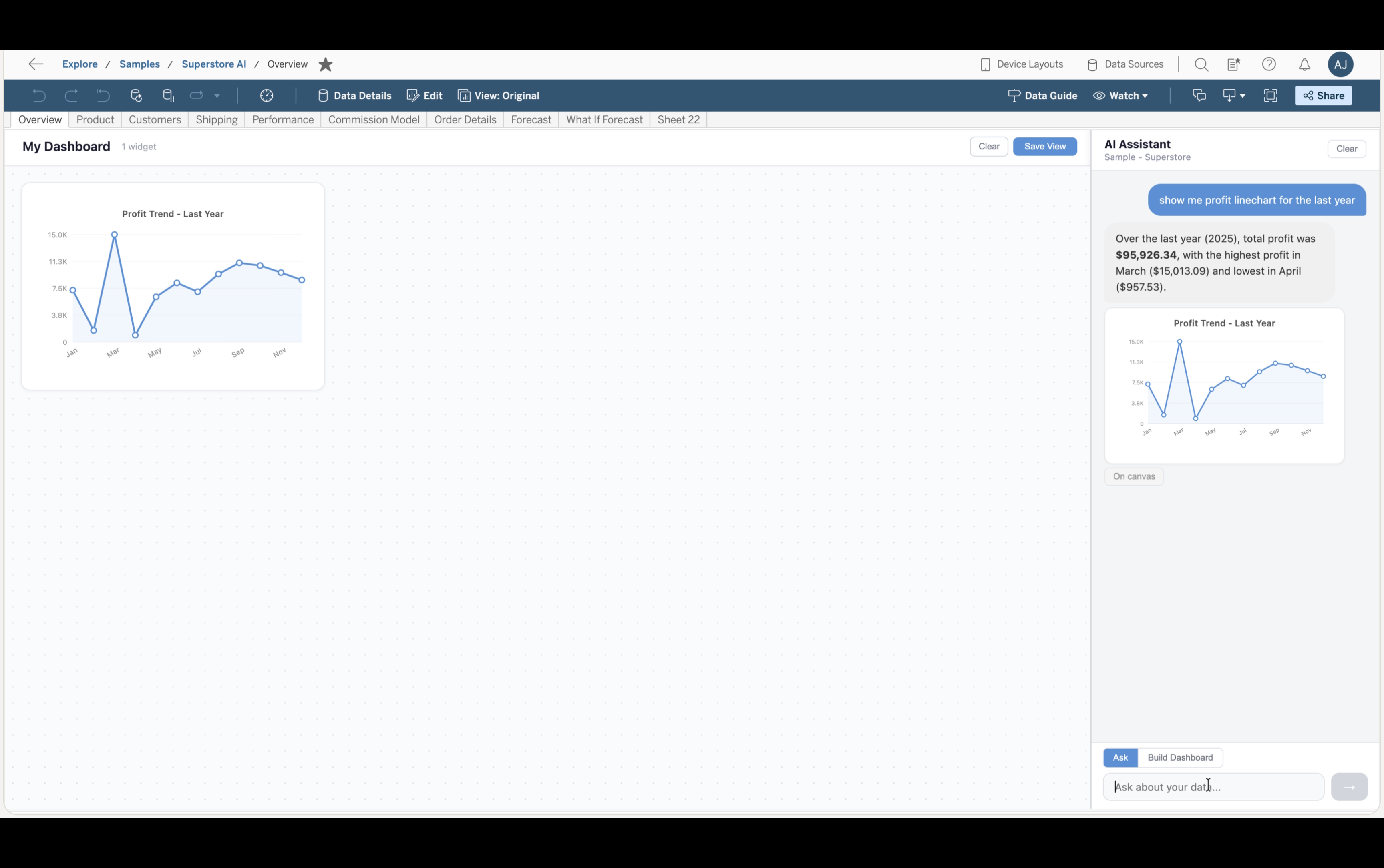
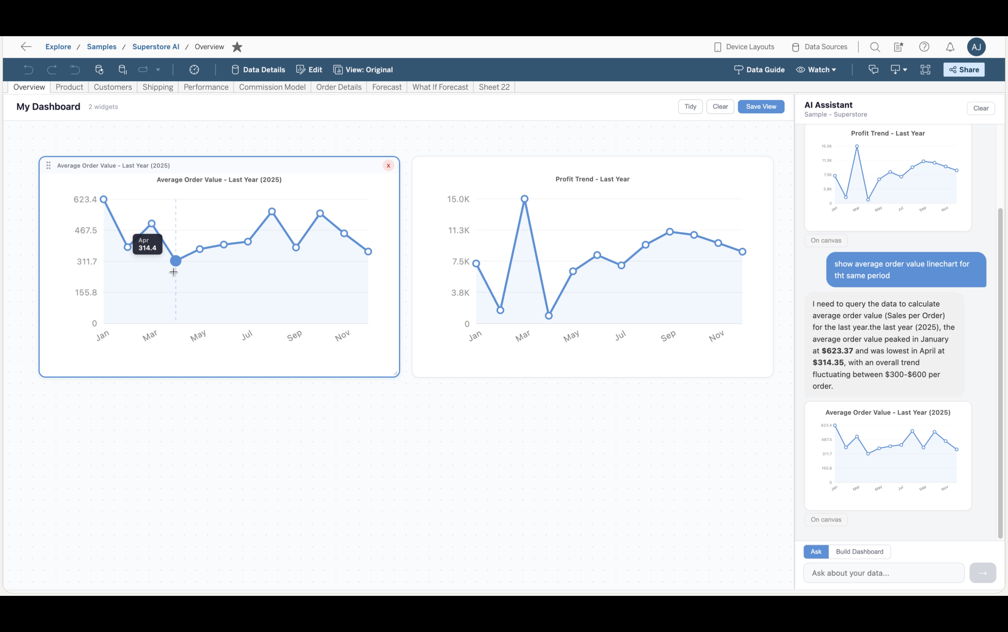
The layout now splits into two parts: a canvas on the left and the chat on the right.
In this mode, every chart the AI generates gets an “Add to canvas” button. One click places the widget on the canvas, where it can be dragged, resized, and rearranged. The layout is saved through the Tableau Extensions Settings API (a built-in storage mechanism for extensions) and persists for anyone who opens the dashboard.
Dashboard Generation
Beyond individual questions, the extension has a Build Dashboard mode. You type a prompt like “Sales performance dashboard” and the AI plans the structure, then executes each part sequentially, querying real data for every widget.
The result: KPI cards at the top, charts with category breakdowns and comparisons in the middle, a detail table, and an insights card with data-driven observations at the bottom. Everything can be dragged, resized, or deleted. The “Tidy” button snaps widgets to a grid, and “Save” persists the layout.
Limitations
This is not going to produce a perfect dashboard. And it won’t produce the same result twice. Every generation is different, sometimes you get a useful trend chart, sometimes the AI skips it entirely. Chart types vary, the layout shifts. That’s the nature of generative AI.
But there are ways to work with it. More specific prompts produce more predictable results. You can switch to Ask mode and add missing charts one by one. And sometimes a rough dashboard generated in seconds is exactly what’s needed: a quick visual playground to explore data and spot patterns before committing to a proper build.
On-Prem Compatibility
If you’re on Tableau Server on-prem, you currently cannot use Pulse, Tableau Agent, or any of the new AI features. They’re Cloud-exclusive. For many organizations, Cloud is not an option.
This architecture is platform-agnostic. The MCP server uses PAT and standard REST/VDS APIs, which are identical on Cloud and Server. Everything works the same way behind a firewall. Row-Level Security, governance policies, extract schedules all carry through. The AI respects whatever permissions the PAT user has.
Tech Stack
React for the frontend, Python FastAPI for the backend, Claude by Anthropic as the LLM, and the official Tableau MCP Server for data access.